My Projects
Where ideas transform into digital reality
Featured Work
A selection of projects that highlight my work in building practical and innovative digital solutions. Each project is the result of thoughtful planning, modern technology, and a focus on creating something that actually works for users.
Web Applications
Full-stack web applications built with modern frameworks and best practices.
UI/UX Design
User-centered design solutions that prioritize usability and visual appeal.
System Solutions
Enterprise-grade solutions for complex business requirements and workflows.
Featured Projects
Project Dionysus
Codename "Streamline" — a streaming website for movies with a working database. Built using Next.js, React, Tailwind, PostgreSQL, and Backblaze B2. Features a full user experience and robust onboarding.
Project Arachnid
Codename "Araneae" — This is the portfolio website you are currently viewing. Designed and developed for speed, accessibility, and a modern developer aesthetic.
Coming Soon
A new project is on the way. Stay tuned!
Coming Soon
A new project is on the way. Stay tuned!
Coming Soon
A new project is on the way. Stay tuned!
Coming Soon
A new project is on the way. Stay tuned!
Other Projects
Pre-Sales Manual
An internal E-Learning platform for the company, designed to streamline pre-sales training and onboarding. Built with Next.js, React, Tailwind CSS, and PostgreSQL for robust content management and user tracking.
Project Article & What's Next.
Project Dionysus (Streamline)
Project Dionysus, also known as Streamline, is my latest movie streaming platform designed to completely redefine how users discover, watch, and interact with cinematic content. With a sleek, modern interface and a powerful backend, it delivers Netflix-quality streaming experiences while staying fast, intuitive, and fun.
Clean and intuitive navigation, modern UI design, and responsive layouts that work beautifully on any device. Administrators and users alike benefit from streamlined management and content discovery.
- Full 4K streaming support
- Advanced search and movie catalog
- User management and admin dashboard
- Clean, modern UI/UX design
- Scalable architecture for smooth streaming
Continuously evolving! Expect more interactive features, smarter recommendations, and an even smoother streaming experience. Watch this space for updates that make binge-watching smarter, not just longer.
Project Echo (Coming Soon)
Project Echo is my soon-to-be-launched music app, where casual listeners meet serious musicians. Discover hidden gems, share your own tracks, or get lost in playlists curated by algorithmic serendipity. Basically, Spotify met your quirky friend who always knows the next big hit—and they decided to make an app together.
Intuitive navigation, playful UI, and a discovery feed that adapts to your taste. Whether you’re a music nerd or a casual listener, you’ll feel at home.
- Personalized playlists
- Track sharing
- Artist profiles
Launching soon! Expect dynamic playlists, surprise beats, and possibly spontaneous dance breaks. Headphones recommended. Dance skills optional.
Rebus Company Website
The draft website of the construction company I work for. Right now, it’s a blueprint stage online—bricks are metaphorical, but the potential is very real. Designed to give clients confidence while proving that construction websites don’t have to be boring (even if they mostly involve boring things).
Professional, clean, and easy to navigate. Clients can browse projects, learn about services, and get in touch without getting lost in the scaffolding.
- Responsive layout
- Project gallery
- Contact portal
- SEO optimization
Might replace the placeholder content with real project showcases, client testimonials, and maybe a virtual hard hat tour. Safety first, even online!
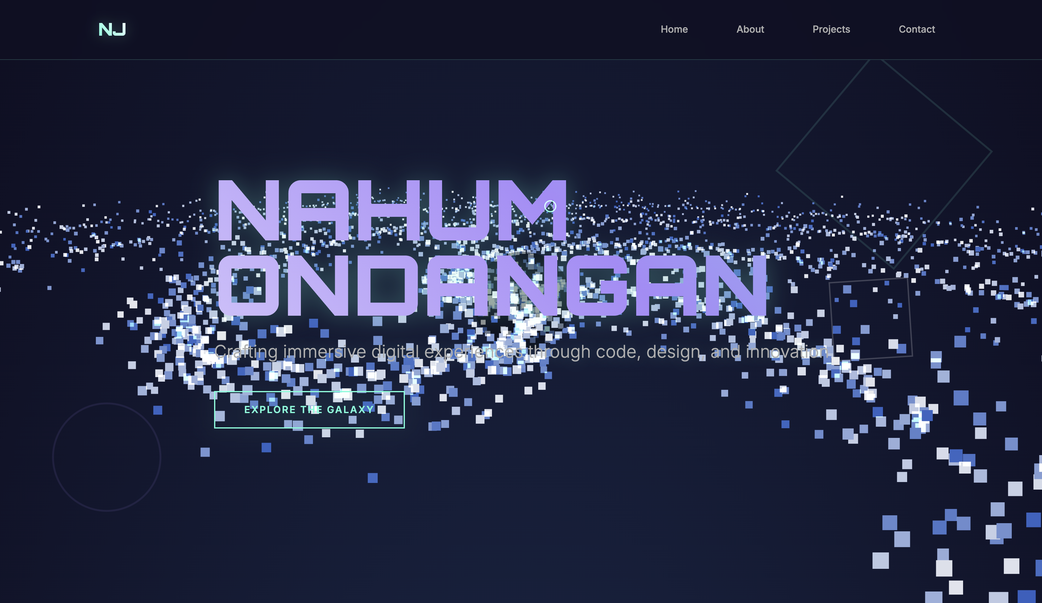
Portfolio - Galaxy Theme
A galaxy-themed portfolio whipped up in under an hour—because sometimes creativity hits faster than caffeine. Fly through black holes, spiral galaxies, and scattered stars while browsing my work. Cosmic, chaotic, and slightly caffeinated.
Animated backgrounds, cosmic transitions, and a navigation experience that’s out of this world. (No spaceship required.)
- Animated galaxy theme
- Smooth navigation
- Responsive design
- Quick project previews
Might not expand. The universe is already big enough. But hey, maybe some interactive constellations or a wormhole or two for quick navigation?
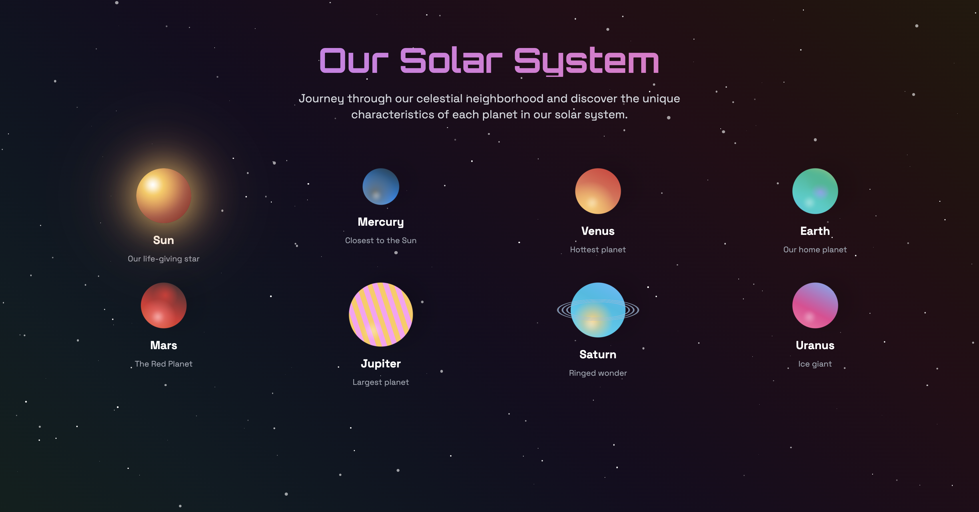
Cosmic Explorer
A side project for stargazers, dreamers, and anyone who’s ever wanted to explain the universe to their cat. Explore planets, constellations, and our solar system straight from your browser—Extravehicular Mobility Unit Helmet (EMU Helmet) is optional.
Interactive, educational, and visually engaging. Designed for curiosity and easy exploration—no rocket science degree required.
- Solar system explorer
- Constellation viewer
- Fun facts
- Nerdy.
I might not add much more—after all, space is vast and mysterious. But who knows? Maybe a few Easter eggs or hidden facts about black holes.
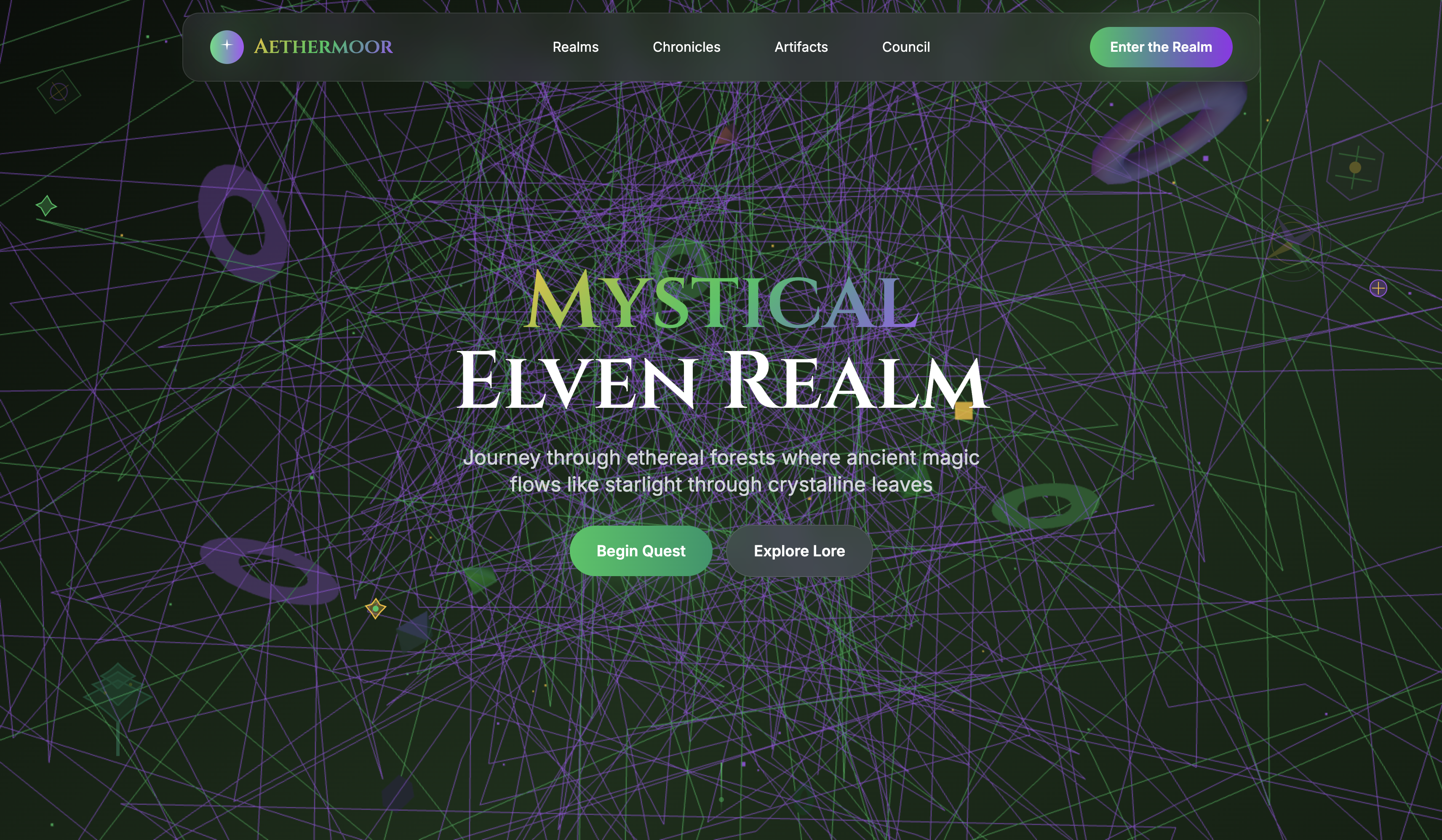
Aethermoor
A high-energy, chaotic website that might give you a seizure—or a smile. Bright colors, random animations, and the digital equivalent of a confetti cannon. Pure whimsy, total chaos, and 100% intentional (probably).
Unpredictable, lively, and memorable. For those who like their web experiences with a side of chaos.
- Random animations
- Colorful UI
- Surprise interactions
- Responsive design
Considering toning it down… or not. Sometimes chaos is the feature, not the bug. Either way, you won’t forget it.
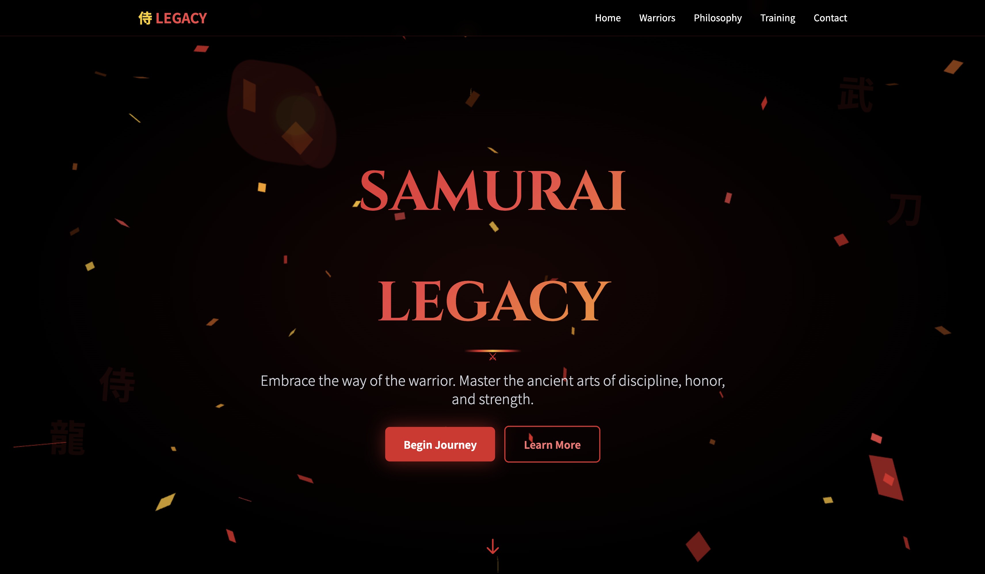
Samurai Website
Step into the digital dojo. A Japanese-themed project honoring samurai aesthetics and subtle elegance. Expect scrollable landscapes, minimalist UI, and maybe a digital katana or two (no actual swords, we’re online here).
Minimalist, elegant, and calming. Designed for focus and appreciation of detail—no fighting required.
- Japanese-inspired design
- Minimalist UI
- Smooth scrolling
- Responsive layout
Maybe add cherry blossom animations, or maybe not. Sometimes simplicity is the ultimate sophistication.
Classic Mini Projects
A throwback to my earliest creations: Typing Test, CPS Tester, Calculator. Charming, functional, and rough around the edges—basically the training wheels of my coding journey. Each taught me something new about coding, design, and surviving 2 AM bugs.
Simple, fast, and functional. No frills—just pure utility and a bit of nostalgia.
- Typing test
- CPS tester
- Calculator
- Basic UI
Planning to remake these classics with modern UI/UX, smoother interactions. Polished gems in progress.
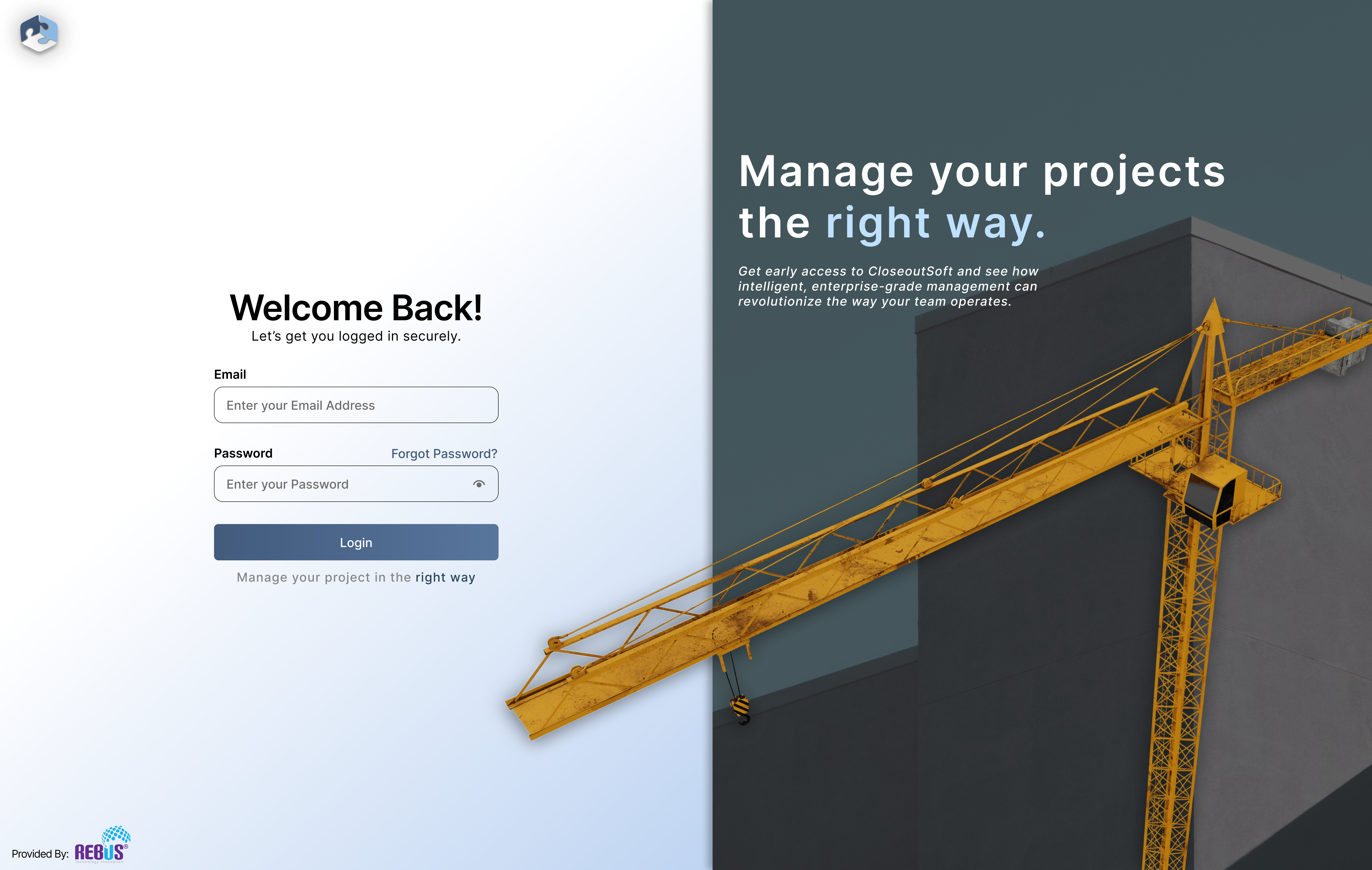
CloseoutSoft – Enterprise Construction Management App
At Rebus Technology Solutions, I worked on the design and development of CloseoutSoft — an enterprise-level construction management platform built to streamline documentation, communication, and project closeouts. My main focus was crafting a seamless multi-device experience through Figma — designing responsive tablet, mobile, and desktop interfaces that balance functionality with visual clarity. The goal: make heavy enterprise workflows feel intuitive, efficient, and clean.
Designed with scalability and clarity in mind, the UI adapts seamlessly across devices — ensuring engineers in the field, managers in the office, and administrators behind dashboards all share a consistent, intuitive experience. The login screen, in particular, represents the design philosophy: professional, modern, and immediately trustworthy.
- Figma design system for tablet, mobile, and desktop views
- Enterprise-grade UI/UX with focus on usability and clarity
- Real-time Document Management System (DMS) integration
- AWS S3-based file storage and retrieval
- Folder creation, file uploads, and previewing in real time
Ofcourse i wont spoil too much, but the next steps involve refining the mobile experience further, enhancing offline capabilities for field use, and integrating more real-time collaboration features to support construction teams on-site.
Creative Design Philosophy
Design, to me, isn’t just about making things look pretty — it’s about making people *feel* something. Every pixel, color, and animation should have a reason to exist (and not just because it looks cool). Whether I’m building a clean enterprise dashboard or a galaxy-themed portfolio, I see design as a conversation — one where visuals do the talking and logic keeps things in check.
Good UX doesn’t start with code — it starts with empathy (and maybe a few too many cups of coffee). I try to design like a user, think like a developer, and simplify like someone explaining it to their grandma. The goal: make every interaction feel natural, intentional, and a little delightful.
- Figma-driven prototyping and experiments
- Motion design that actually means something
- Clean layouts made for real humans, not robots
- Design systems that look good and scale even better
- Finding that sweet spot between creativity and clarity
I’m always experimenting with ways to make my designs more alive — mixing storytelling, animation, and solid UI principles into something that feels human, interactive, and maybe even a little fun to use. Basically, if it moves, clicks, or glows in a satisfying way, I’m interested.
CloseoutSoft Mobile Design
Designing the mobile experience for CloseoutSoft — an enterprise-level construction management platform by Rebus Technology Solutions — was a deep dive into balancing complexity with clarity. Mobile design for enterprise software isn’t just about shrinking layouts; it’s about rethinking workflows. My goal was to translate powerful desktop-level functionality into a touch-friendly, intuitive experience that construction teams could use seamlessly on-site.
I approached the design with a ‘field-first’ mindset — prioritizing speed, readability, and ease of access. Each screen was crafted in Figma with careful attention to hierarchy, spacing, and ergonomics, ensuring that users could navigate one-handed, even in challenging environments. The color palette and contrast were chosen for outdoor readability, while the interface remains consistent with CloseoutSoft’s brand and enterprise identity.
- Mobile-first Figma prototypes for key workflows
- Responsive and adaptive UI for real-world field use
- Simplified navigation and modular screen layouts
- Offline-first consideration for on-site scenarios
- Consistent design language aligned with the desktop platform
The next steps involve refining microinteractions, enhancing accessibility for field conditions, and integrating smoother navigation gestures. The vision is to make mobile not just a companion to desktop, but a fully capable control center for field operations.
Have a Project in Mind?
I’m always excited to work on new projects and bring innovative ideas to life.
Let’s discuss how we can turn your vision into reality.